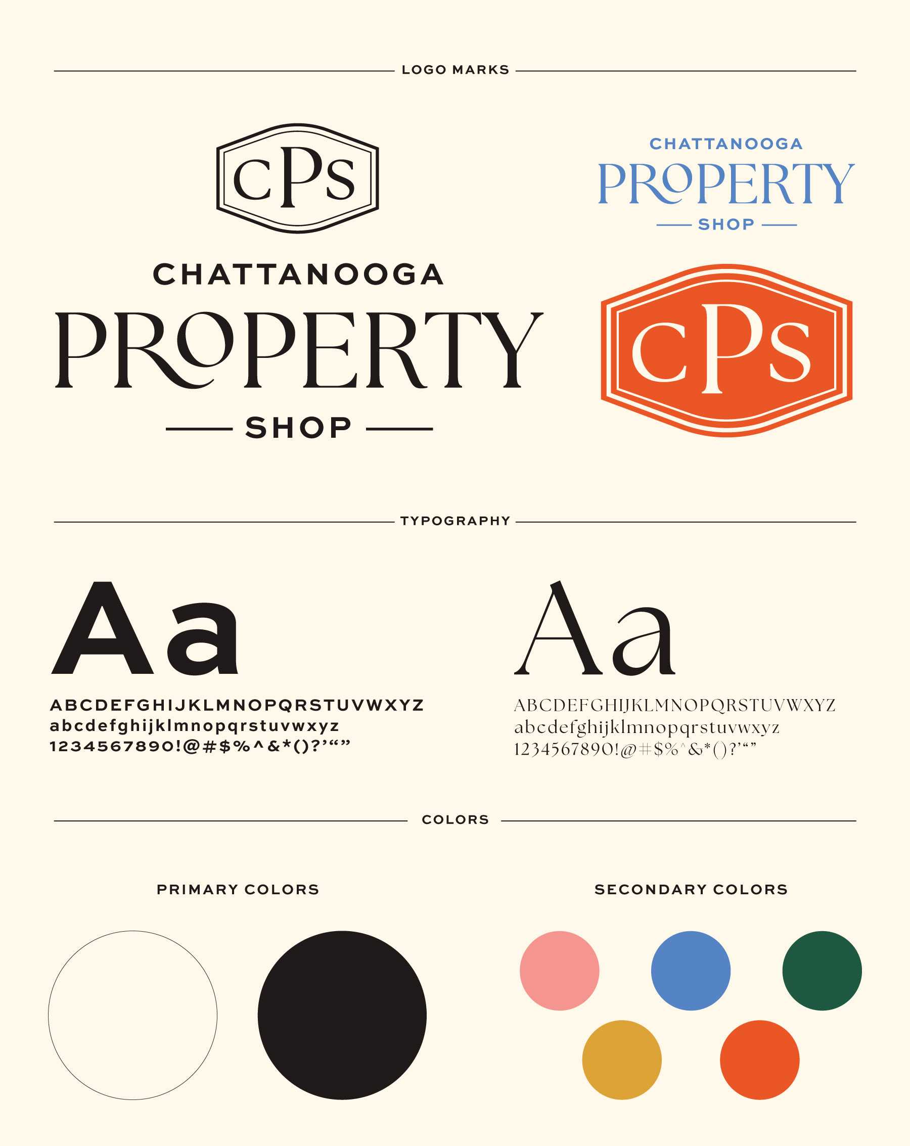
Chattanooga Property Shop is a woman-owned realty team serving Chattanooga and North Georgia, and they asked Riverworks to build a brand identity that felt classy, modern, and welcoming. They wanted something that would stand out in real estate but still feel like home.
We crafted a refined brand package centered around a monogram badge of their initials paired with a sleek serif + sans-serif wordmark. The color palette of soft cream and muted black gives their identity a sense of luxury and reliability, while subtle accent tones add warmth and versatility across marketing materials. The result is a brand that feels timeless yet fresh, helping position Chattanooga Property Shop as a trusted, professional partner in real estate.

